By default, your widgets use the colors from your branding. You can change them for all your widgets at once, or for a single widget.
For all your widgets
- Go to My company → Integrations → Styling defaults.
- Change what you want (see the table). If you leave a color empty, the widget uses the color from your branding.
- Click Save.
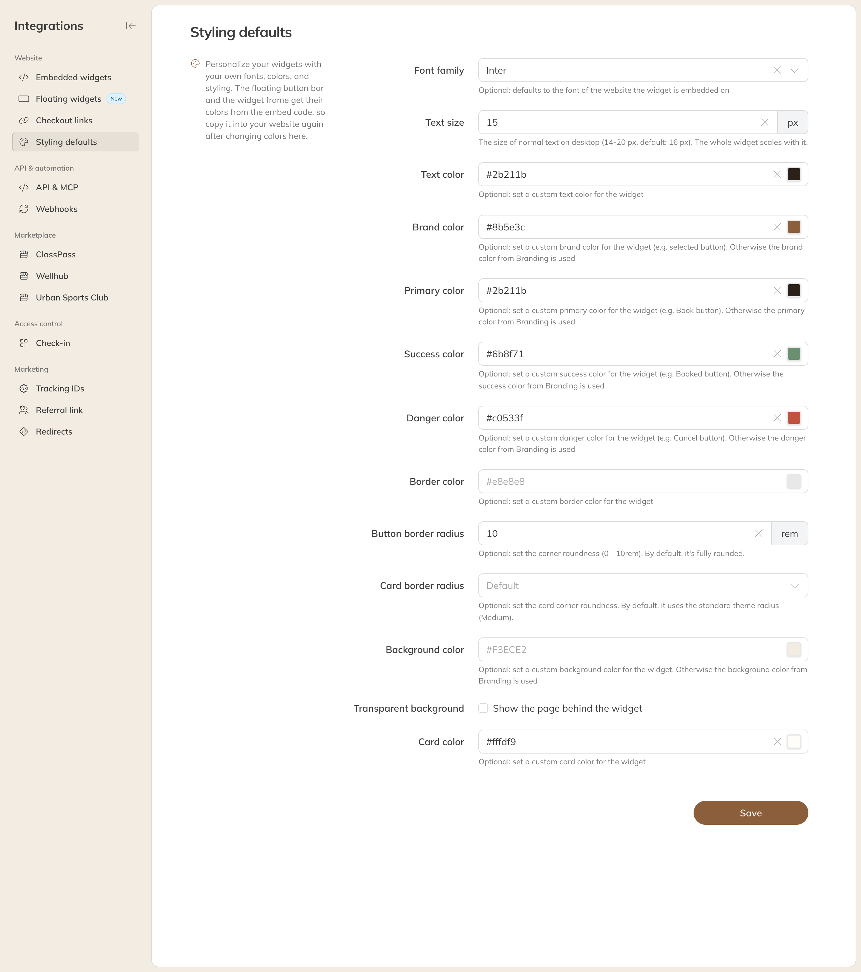
The styling defaults of your widgets
| Option | What it does |
|---|---|
| Font | By default, the widget uses the font of the website it is on |
| Text size | The size of normal text on a computer, 14 to 20 px (default 16). The whole widget scales with it. |
| Text color and Border color | The color of the text and of the borders |
| Brand color | For example the selected button |
| Primary color | For example the Book button |
| Success color and Danger color | For example the Booked and Cancel buttons |
| Button radius and Card radius | How rounded the corners of buttons and cards are |
| Background color and Card color | The background of the widget and of the cards in it |
| Transparent background | Your website's page shows through the widget |
Note: The floating widget and the frame around a widget take their colors from the embed code. Changed colors here? Copy the embed code to your website again.
For a single widget
- Open the widget under Embedded widgets or Floating widgets.
- Under Styling, turn on the Override styling defaults switch.
- Only fill in what should be different. Empty fields use the styling defaults.
- Click Save and put the new embed code on your website.
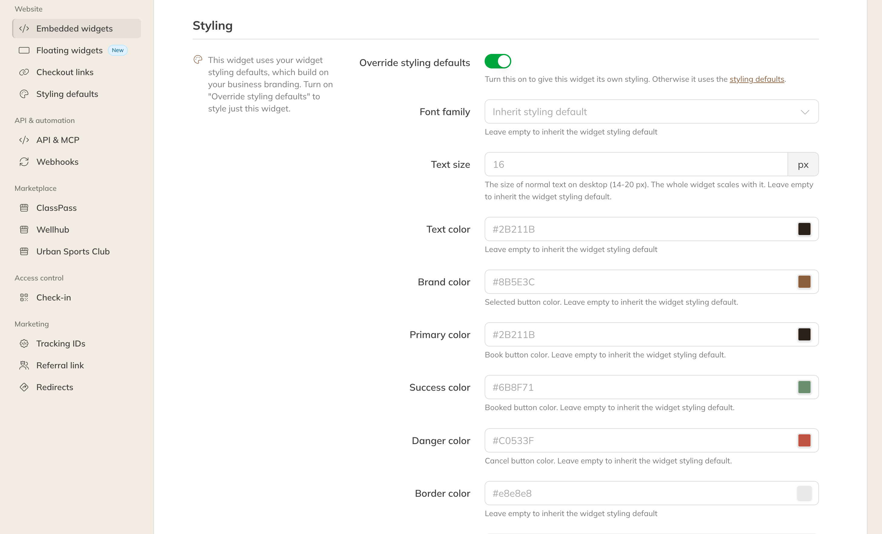
Custom styling for a single widget
If you turn the switch off again, the widget follows the styling defaults once more.
Tip: Check under Preview at the bottom of a widget's page how your colors look before you put the code on your website.